
16. Glorya-Bodega Gil Berzal
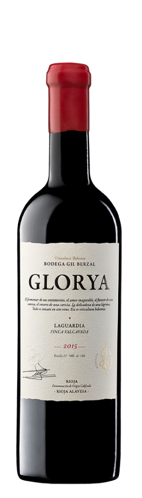
Glorya is one of great and simple examples of a classic design. Although it contains no illustration as the majority of classic wine labels, it does look like a classic one thanks to simplicity, typography and decoratively cut edges.
17. Yao Ming
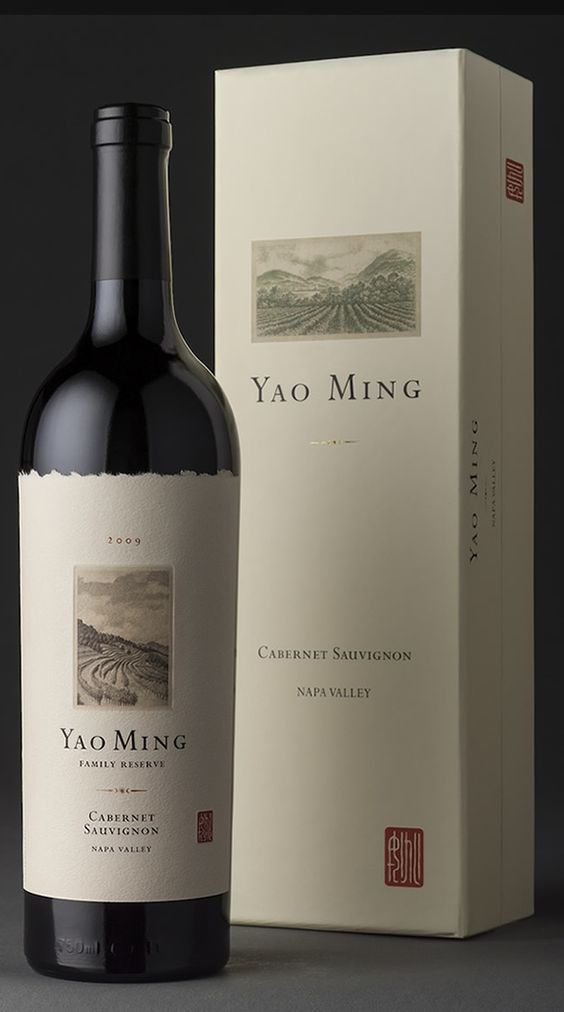
A small illustration on a white background. What could look better?
18. Savervin
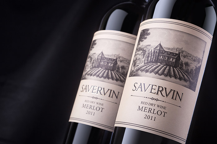
The combination of a framed label and a Serif style can be one of the solutions. Just keep in mind that the contrast of colors and the highlights is important here to represent information.
19. De La Ligne
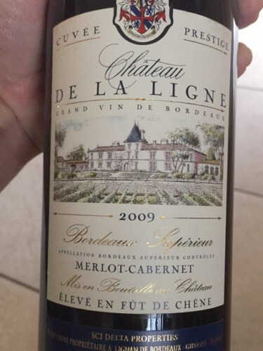
This wine was produced in 2009. However, the label doesn’t speak to it. Here we have a perfect classic label example where all the features that have been mentioned above are used.
20. Cabernet Sauvignon
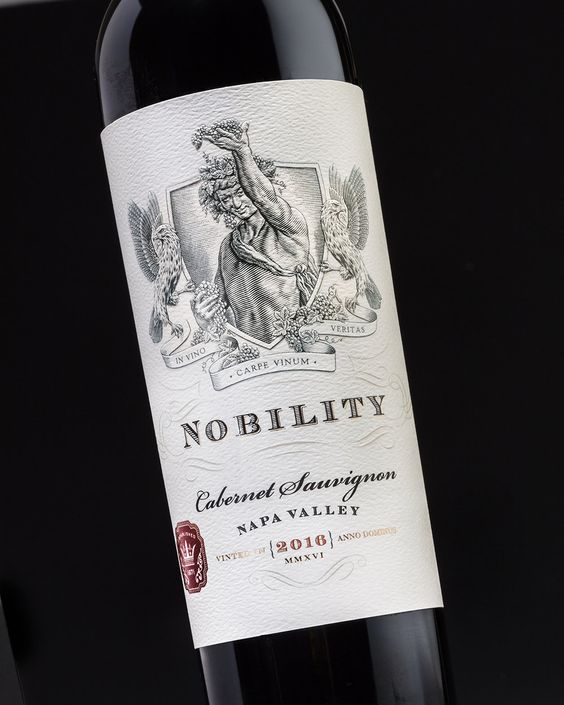
When designing a product packaging, very often the sense of touch isn’t taken into consideration although it is as important as the visuals are. Using a more textured and thick paper will leave an impression of commitment and high quality. You can also use extra protection on the label to make it look and feel better.
Summary
Designers commonly use a font that resembles an old writing style which is accompanied with hot-stamping or golden foil print and illustrations of the vineyard to create an expensive and classic appearance. The following techniques are also used to create classically themed labels:
- Illustration or coat of arms;
- White, pale or black background;
- Serif style or cursive background;
- Subtle use of color;
- Outlines or decoratively cut corners;Lots of open space.