
6. Ridgerlands – Elgin Vintners
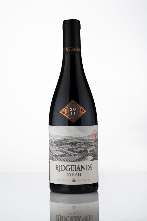
Don’t be afraid of not putting too much information on the front side of the wine label. The less writings the less confusion by the customers. In such cases you will have room for something impressive like a map, picture or anything that is connected with your brand.
7. Cabernet Sauvignon- Jordan
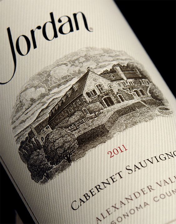
Use the technique of nicely structured introduction of wine on the front label. Wine lovers aren’t always necessarily wine experts so the easier the information is understood the better. Make sure that the fonts you use are readable enough not to cause misunderstanding.
8. Merlot – St. Francis
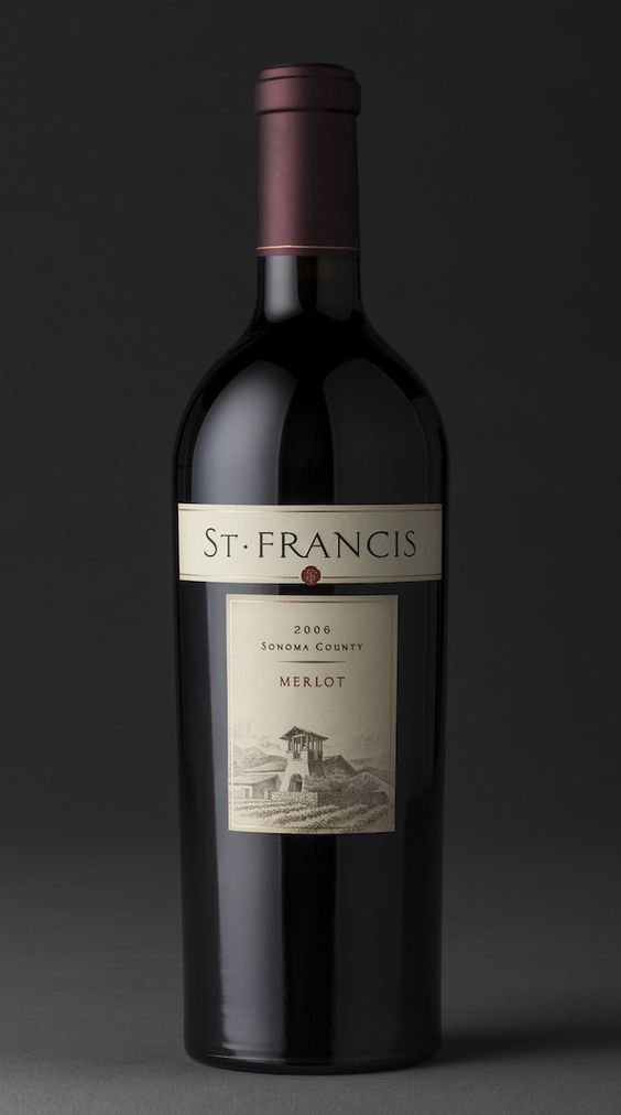
Frame your label with a simple line or an ornament. As classic labels most likely tend to have a lighter background, such details look good and complete the design and enhance it.
9. Miros de Ribera – Ribera del Ruero
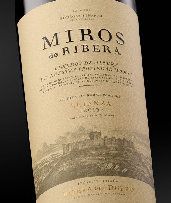
Use white, pale or black background. Too many colors are unnecessary on a classic label, while lighter ones are pleasing to eye.
10. Araujo- Eisele Vineyard
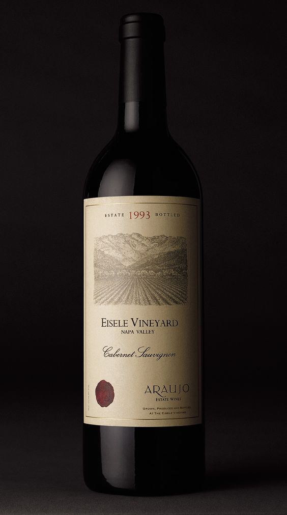
Use a stamp trying to match its color with some other elements on the label. This example will help you imagine how effective this technique turns out to be.