
Generally, when speaking about the design of the wine bottle, what people pay attention to is the label of the wine bottle. Nowadays, wine label is one of the most important marketing tools that wine producers use to promote sales by catching customers’ attention and leaving a deep impression. They use all their creativity to make their wine look outstanding on the shelf and differ from the rest. The industry of wine represents a wide variety of labels from classic to modern ones depending on the producer’s taste, outlook and purpose. So, if you are a winemaker, you shall be sure that you wine labels stack up against the competition. Labels of different themes mostly represent an exact area and type of wine.
For instance, classic wine growing regions, – such as Bordeaux and Burgundy, France; Piedmont, Italy; Rioja, Spain; and Napa, California, are popular with their classic labels. This kind of labels are preferred by a lot of wineries which try to promote sales by creating a classic (traditional) label because such labels psychologically create an impression of a high-quality, old heritage wine.
Check out some of the best examples in classic wine label design.
- Grand Cru Classé-Chateau Fonplégade
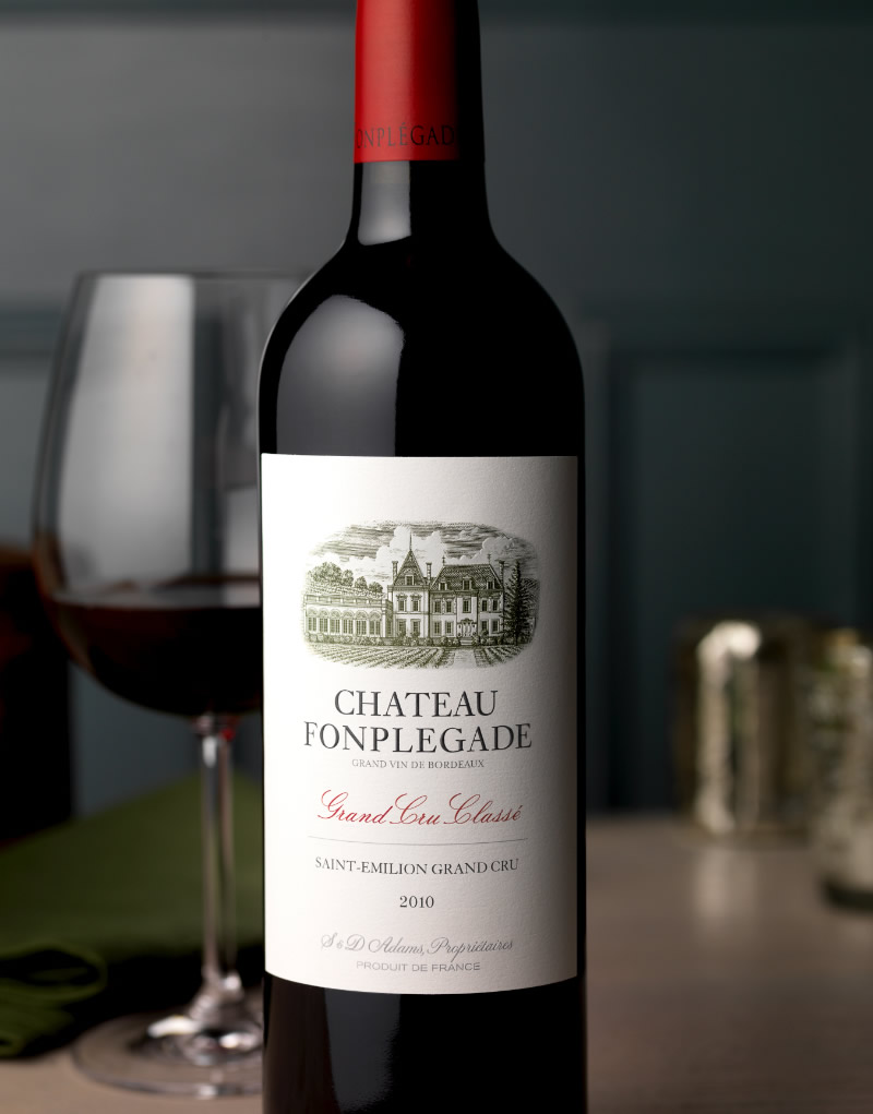
One of the greatest examples of a classic wine label can be that of this nice French wine which was made in a winery that has a history of 500 years. The handwritten font, an illustration of the winery and the color choice give classical style to the label. So always go for these techniques if a classic label is what you are striving for!
2. Bodega Gil Berzal – Recoveco
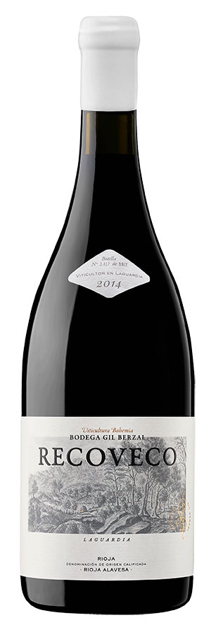
Looking at this label one has a feeling of a nice red wine. This Spanish brand has used almost all the techniques to get a classic appearance. Pay attention to the illustration of the winery, clear and readable fonts which are combined with a simple white background and a golden foil print.
3. Reserva Original- Ramon Bilbao
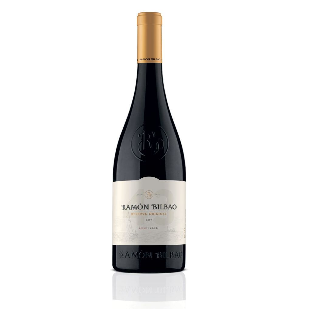
If you made up your mind on having a classic wine label, use golden foil prints. It gives the label a more elegant, simple but eye-catching appearance as it reflects light on the label in a different way. Ramon Bilbao is a Spanish wine brand. As you see, the “tradition” of having the illustration of vineyards on the background is a very common practice. Golden foil print looks good especially when the bottle has a gold bottle top. In this case, black is used for the rest of the text to ensure readability.
4. Villa Mon Rêve-GAYDA
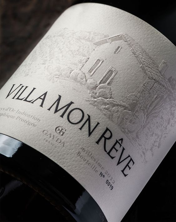
Make sure your label tells your story. Villa Mon Rêve is a perfect example of a classic label. The story behind this label is that the previous owner of the area built the cottage represented on the label hoping to have some more happy years there with his ailing wife. The Cottage was surrounded with vineyards and once his wife suddenly recovered the cottage was called “Villa Mon Rêve” which is translated as “The house of my dream”. This story inspired the winemaker to choose the name and to create a classic label for his brand.
5. Clos des Jacobins – Grand Cru Classe
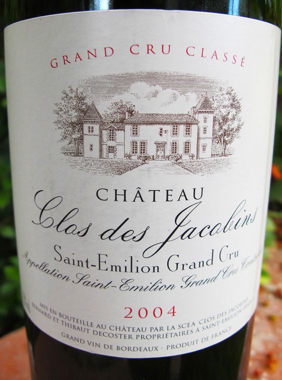
Pay attention to font pairings. A combination of hand-written font with a readable one will always make your label differ from the rest on the same shelf. Here is a bright example of how an interesting pairing of fonts can make a white background label look outstanding.